The new iPod shuffle: Button, button, who's got the button?
[via macworld]
That shouldn’t come as a surprise to you: the Apple CEO has been on a crusade to wipe moving parts from the face of Apple’s products as early as the replacement of PowerBook trackballs with trackpads or the removal of the physical scroll wheel from the original iPod. The iPhone and iPod touch were further steps towards a button-free world, relegating as many controls as possible on the touchscreen.
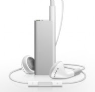
And now we have the buttonless iPod shuffle. With the exception of a single switch that controls the unit's power and lets you change between shuffle and ordered play, the iPod shuffle itself contains no buttons. Instead, the playback controls are integrated into the headphone cord: you can squeeze either the top, bottom, or center of the remote to execute different functions.If you ask me, the war on buttons has gone too far. The new iPod shuffle takes a step back in both the usability and compatibility departments. Don’t get me wrong, the new VoiceOver feature is a very clever idea, especially on a device with no screen. But the rest of the changes make me wonder if Apple has placed too high a premium on the product's form over its function.
I admit, I haven’t had a chance to handle a new shuffle yet, so it’s possible all my concerns are for naught, but from my initial impressions, I think that the move from the second-generation shuffle’s controls to the new remote-based controls are a poor decision on the part of Apple’s design team. Let’s look at it in relation to its predecessor.

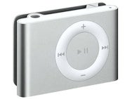
The second-generation iPod shuffle’s controls are pretty familiar to anyone who’s used any sort of playback device, whether it be an iPod, other music player, or even a DVD player. The buttons are clearly marked with the nearly-universal symbols for Play/Pause, forward, previous, and "more" and "less." This is an iPod that my mom or dad could pick up and grasp without too much trouble.
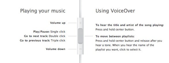
Now the new iPod shuffle:

The fact that Apple has to put up this diagram tells you how much more complicated it is: how would you figure out the controls without this chart? The only markings on the controls are the "+" and "-" that mark volume controls. There is no indication of how to play or pause music. There’s also no way to know where the previous or next track buttons are; you wouldn't be out of line thinking that it might involve the use of the volume up and down buttons—not so. In order to go to the next track, you double-click the center of the controller; to go the previous track, you triple-click the controller. You can also hold down the center button to hear the name of the currently playing track, then release it after a beep to hear the name of all your playlists.
Look, even buttons have their place: having discrete controls for discrete functions is not necessarily a design failure. Sometimes it's just the best way to get the job done. There's no inherent, intuitive cognitive connection between double-clicking to go forward or triple-clicking to go back; it requires the forging of a new link in our minds. Where does it end? Will future versions require you to quadruple- or quintuple-click? Will there be a system where you can spell out the name of the song, artist, or album you want in Morse code?
I realize that it seems elegant to Apple—look, ma, no moving parts—but anybody who’s going to spend some time helping a less-than-tech-savvy individual deal with their new iPod is quickly going to encounter frustration: “No, dad, click three times to go back to that last song. No, don’t hold it down! Okay, let's start again.” It’s enough to make you wish for a feature that lets you click your heels together to go home again.
Then, there’s the lock-in aspect. I suffer from a not uncommon genetic condition called “the stupid iPod earbuds don’t stay in my ears.” I simply can’t use the iPod earbuds for anything that doesn't require me staying absolutely still; if I walk around, the earbuds fall out—never mind jogging. Up until now, no problem: just swap in any pair of headphones, from the cheapest pair of over-the-head models to a $300 pair of noise-cancelling cans. Headphones are headphones are headphones, right?
Alas, no more. The decision to put the controls on the headphones means that unless Apple opens up the controls to third parties, you can’t even play music on the iPod without using Apple’s own earbuds. What happens if, as is also not unheard of, Apple's stock earbuds break? Your iPod is completely useless until you get another pair of approved headphones. This is not Sparta, this is madness.
I know there will be plenty who say: well, the iPod shuffle isn’t for you, then. True, it’s not; I'll stick to my fifth-generation iPod or a nano. But it also means the new shuffle won’t be the iPod I’d recommend to others, as the previous shuffle often was.
I understand the desire for the Apple design team to push themselves and try to accomplish something new and perhaps even revolutionary, but in the words of Dr. Ian Malcolm, perhaps they were so preoccupied with whether or not they could, they didn’t stop to think if they should.
Found this Post interesting? Receive new posts via RSS (What is RSS?) or Subscribe to CR by Email


